Creating a portfolio photo site with WordPress
As photographers (dropping the “stock” word for a moment) we all like to create artistic masterpieces that truly capture the grandeur of a place or landscape – especially if the sun is rising or setting at the same time. There is just something about the conjunction of colors that automatically attracts us to sunsets! Often such sites are simply to let friends and family see the best shots we have taken – pointing someone to a stock agency and saying “search” is hardly the same! Of course, strangers may also find the site and through that approach you for licensing or prints, but it isn’t often designed for that purpose. For a long time, I used SmugMug to host my fine art site, and I built up many galleries over the years. Their recent price hikes brought that seriously into question and I decided, a month ago, to move myself onto my own hosted site created with WordPress. As I’ve mentioned before, I moved my main stock site to dedicated hosting and so I could create a new wordpress site on the same host at no incremental cost. If you have no web presence at all, you would have to buy a $4.99 monthly hosting package to get started.
The first big issue I came across was what theme to use? A word of explanation. WordPress is a very flexible content management package that can be customized to look like anything you have in mind. There are free themes that apply customization of pages, fonts, color etc. and then specially designed themes for a particular purpose. You could set about designing your own from scratch,
but that is probably beyond most of us. So I started looking for a Photography theme and typed typical words like “wordpress photography portfolio theme” into Google. If you try this, you get many hits, but most of them are affiliate factories – they list and describe each theme (probably using text from the theme site) and provide an affiliate link via which they can make some money if you eventually buy that theme. As an objective review, they are pretty useless. So my first task was to go to each of the popular (by downloads) themes and do my own research, checking out example portfolios built using that theme, and looking at when last it was updated, was there and active support forum and so on. After much research I decided on the Photocrati theme. It is not the cheapest theme (at $79) but it comes with an unconditional 30 day refund and the artist sites built using the theme were attractive and professional. I think I finally decided that with such a high volume of users, an active support environment, good documentation and a lot of flexibility, it was also the safe choice for me. The only thing I was uneasy about was that the theme doesn’t automatically read the title, description and keywords from uploaded images – I contacted support and immediately got a response saying that they were working on it for a late spring release, but it isn’t there yet. As I found out (and will describe), if you create collections in Lightroom that mirror your site, it will be easy to update images later if you want to have those elements visible on the site.
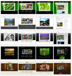
Out of the box, the theme comes with sixty different styles – colors, frame, approaches etc. You basically start with the one you think most closely matches what you are trying to achieve, and then you can customize it in all sorts of ways to meet your exact needs. For instance, I wanted a black background to make the images pop, then I wanted my own logo, a small menu, fonts that looked more like handwriting than type etc. All very easily modified within the editing system provided in the theme.
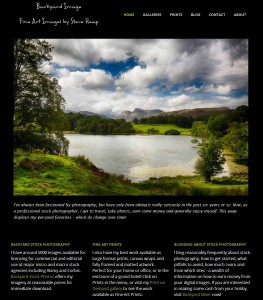
So what can you create? My home page is shown over on the right. On different pages of your blog, you can have text – for instance an “about me” page. You can add slide shows, single images, slide shows with image sliders, blocks of image and so on. A collection of images on a page is known as a gallery, and you can add text around it. You can show the image descriptions if you want, and obviously change the timings of slides and the transitions. Each gallery can be stacked inside another page – so your menu will show Europe, for instance, then England, Germany etc. as sub menus. The top level page can have thumbnails of each gallery as an alternate way of getting to the required images. You can play music (I don’t really like that on a website).
Having played around with the formatting until I got the result I wanted, I started to think about uploading images. Several years of uploading to Smugmug gave me quite a collection and, of course, I didn’t keep any local records of what I uploaded! This time will be different! I have all my images in one Lightroom catalog, and after processing, I add a flag to the ones that I like (and also plan to upload to stock agencies). I keyword and describe in Lightroom as well. So my plan was to first create my gallery structure on paper – how many top level menu items, how many sub menus etc. My aim was to keep the number of images in a slide show to around 20-30 or so. Then I created that structure as a series of collections in Lightroom. I added one called Favorites which was destined for the home page. Then it was a matter of searching for the relevant keyword, filtering by the flag, and then dragging the images I really liked into the collection. With the export set to Jpeg, 50 quality and 1200px maximum length I was ready to export the images gallery by gallery and import them into the newly created page on the wordpress site. You can re-order images as needed on the site, and so I just uploaded by date order, but you could sort in the collection. Now, when the new theme release come along I can just import those files again and have the data read and titles automatically appear if I need to. The site is right click protected by the theme, but I decided to use un-watermarked images so that I didn’t detract from the viewing. I also enabled a plugin called Super Cache to speed up display of the site, but that is too complex for this article!
My overall goal in this was to create a single web presence and branch out from there. I have this site, my stock site and my Fine Art America site at the moment and so the design of BackyardImage was to have all those various sites integrated into one story. Hence the three blocks of text on the home page and the menu items that open the other sites when necessary.
Overall, I didn’t find this to be too complex or difficult at all. Photocrati was was documented, and the longest time was spent trying to decide which my best images actually are – you get attached to these things! I still have quite a number of galleries still to add, but I’m very happy with how it is all progressing!
If you want to investigate Photocrati, I did sign up for their affiliate program which is embedded in this link!


I went to your site Steve and none of the pictures loaded. If I clicked on Galleries-North America, I got a list of all the different galleries, not just North America. When I clicked on each individual one I saw no pictures. Am I the only one?
Hi Patsy – they certainly work for me. Worrying! When you say you clicked on Galleries-North America, was this on the North America menu item? Clicking Galleries brings all of them up, for me, clicking on North America shows just two. What happens if you wait a little while once you have gone to a page?
Steve
I’ll send a screenshot of what I saw…..
Steve, I figured out what the problem was and it wasn’t your website. I had been doing graphics all day and my computer had used up a lot of memory and the pictures just wouldn’t load. I restarted my computer and they loaded perfectly. Great site BTW. I checked it again this morning to be sure and all is well. Sorry for the scare….
Pat